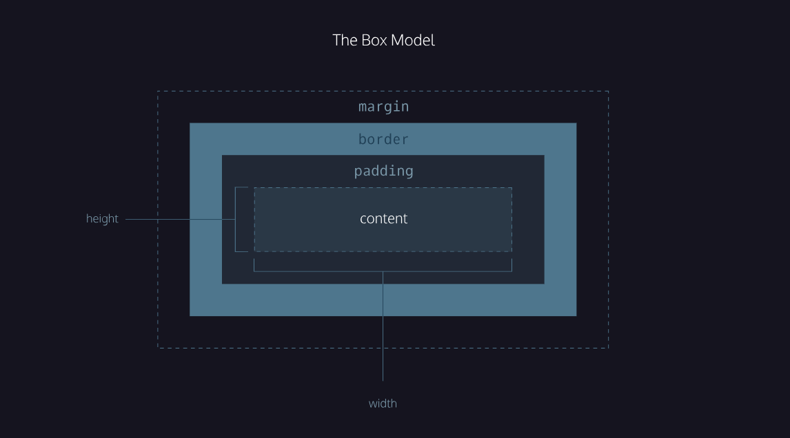

Image credit: Codecademy
This is the content of a paragraph. The content of any item can be adjusted by height, width and
more.
For example:
.content {
background-color: hsla(277, 61%, 50%, 0.6);
height: auto;
width: 100%;
line-height: 1.5;
}
Resize your browser to see how the coloured box width adjusts.
When only adjusting the content css, the box-sizing tag can remain its default content-box and
does not need to be included in the css code.
This is a new paragraph. Here we adjusted the padding. Notice how there is more space
around the text content.
For example:
.padding {
background-color: hsla(290, 100%, 38%, 0.8);
height: auto;
width: 100%;
line-height: 1.4;
padding: 5%;
box-sizing: border-box;
}
When adding padding, we need to change the box-sizing to the new value border-box.
Here is a great explanation for the Box-Sizing property
Now, let's look at borders. We can include a simple border with one line of code.
For example:
.border {
border: 5px solid hsla(326, 85%, 48%, 0.793);
}
This code has the width, style and colour included.
Borders can also be coded in separate line items.
For example:
.border2 {
border-width: 5px;
border-style:double;
border-color: hsla(326, 85%, 48%, 0.793);
border-radius: 10px;
padding: 2%;
}
Here the corners (radius) have also been rounded and a padding added.
Lastly, the margins. Margins are added outside of the border and are blank space. This box has
padding and a border applied, plus additional margins.
For example:
.margin {
background-color: hsla(338, 95%, 52%, 0.919);
padding: 2%;
border: 2px solid black;
margin: 5%;
}
Notice how the visible box shrunk, and blank space was added all around the box.
That's it, bye!